When forecasting goes wrong (maybe): Yemen
Over the past few months we have worked on regularly updating our irregular leadership change models and forecasts in order to provide monthly 6-month ahead forecasts of the probability of irregular leadership change in a large number of countries–but excluding the US–worldwide. Part of that effort has been the occasional glance back at our previous predictions, and particularly more in-depth examinations for notable cases that we missed or got right, to see whether we can improve our modeling as a result. This note is one of these glances back: a postmortem of our Yemen predictions for the first half of 2015.
To provide some background, the ILC forecasts are generated from an ensemble of seven thematic1 split-population duration models. For more details on how this works or what irregular leadership changes are and how we code them, take a look at our R&P paper or this longer arXiv writeup.
We made a couple of changes this year, notably adding data for the 1990’s, which in turn cascaded into more changes because of the variation in ICEWS event data volume. This delayed things a bit, but eventually we were able to generate new forecasts for the time period from January to June 2015, using data up to December 2014. Here were the top predictions:
| Country | 6-month Prob. |
|---|---|
| Burkina Faso | 0.058 |
| Egypt | 0.055 |
| Ukraine | 0.044 |
| India | 0.038 |
| Somalia | 0.038 |
| Afghanistan | 0.035 |
| Nigeria | 0.030 |
The probabilities are from the ensemble forecast and give the probabilities of at least 1 ILC occurring in a country between January and June 2015. To create the table, we ranked countries by these 6-month probabilities and cut off values below some threshold. There is a tradeoff here that any non-perfect model of a 0 or 1, yes/no outcome has: we could have included more cases in this table to increase the chances that we’ll capture any ILCs that do occur, but would then also list a lot of countries that won’t have an ILC. This is really just a tradeoff, there is no correct answer for how to weigh these two factors.
We can say that the forecasts in this table should on average, etc. give us a recall of 0.5, and in an updated paper (not yet public) we also listed another 25 cases that should get us to a recall of 0.75, for those who are more interested in avoiding false negatives than false positive.
Absent from either table is Yemen, which by the time we made the forecasts already seemed to have experienced an ILC, with President Hadi’s resignation in January, and flight to Saudi Arabia in March. Yemen was instead ranked 33 in our 6-month forecasts. The plot below shows the ranking of Yemen in the monthly forecasts from 2014 on:2
![]()
Keeping in mind that we produce forecasts for about a 150 to 160 countries, Yemen’s EBMA ranking is actually fairly high and consistently in the top fifth, around 30 or so. It’s ranked high in the internal conflict and public discontent models, which rely on event aggregations for material conflict between dissidents and government as well as protest, but lower in the other component predictions.
One can argue here about whether we really missed Yemen in our forecasts or not. At face value, it is not in the tables with which we present forecasts in the paper, even if it still ranks fairly highly overall. Either way it would still be better if Yemen had been higher in our forecasts, especially since there has been plenty of violence and instability in Yemen prior to the recent events in 2015.
What made this especially puzzling for us is that in our 2014 models and forecasts, Yemen was in fact ranked much higher, at number 3 for mid-2014 (see Table 2 here).
Why did Yemen’s ranking decrease?
The first step was to try to figure out why it was high in our past rankings, but not now. We changed several aspects of the data and models by including 90’s data, and correcting the models for the changing ICEWS volume over that period as well as some variables we had to drop because 90’s data were not available for them. This gave us the first two candidates for what might explain the difference in Yemen’s ranking: dropping the 90’s data, where event volumes are tricky, and reverting to the 2014 models.
Fast forward through some experimenting, and it turned out that Yemen was ranked higher only when:
- we don’t use 90’s data and instead only use data from 2001 on, which is how we did things last year,
- we use the 2014 models rather than the slightly changed 2015 models,
- and we use some suspicious imputed values for the share of Yemen’s population excluded from power.
Change any of these three factors and Yemen’s forecast ranking drops.
The first two of these factors are related. When we added data for 1990’s it required some effort to cobble together data from a couple of sources. As a result a few variables were dropped out from the 2015 models.
At the same time, while the ICEWS volume from 2001 is stable enough that we didn’t worry about normalization, the 90’s data are generated from a much lower volume of news stories, and thus all the 2015 models now also include a count of the total ICEWS events for each month. The problem is that the number of stories and hence events were not lower in the 90’s because less stuff was happening in the world, but more probably because fewer events were reported in a way that one can capture and code (this was after all in the dark ages of a young internet). So you need to try to “correct” for that.
Data problems are not new in international relations, but a growing awareness of media and reporting biases in the data we do have maybe is, as a side-effect of the proliferation of event data over the past couple of years (hello GDELT).3 We are probably not normalizing as well as we should be, and how to properly normalize event data is something that merits greater investigation.
The last factor is about some suspicious imputed values for a variable related to inter-ethnic power relations in Yemen. These data come from the Ethnic Power Relations (UCLA) dataset, which end in 2010 and are imputed as part of the ICEWS project data for years after that. When adding EPR data for the 1990’s, we plotted series for a few countries, including Yemen:
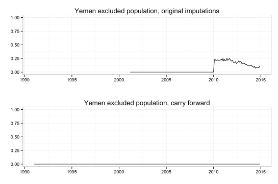
The top plot shows the original data we used. That shift from 2011 on is an artifact of imputation, also given away as such by the sub-annual variation that is impossible since EPR only tracks things in terms of years. Given that the EPR series are largely stable for countries, over stretches of decades, we switched instead to just carrying forward the last observed value.4
All in all it appears that Yemen was lower in the current round of forecasts for several mechanistic reasons that do not necessarily speak much to the underlying subjective events. The real issue is whether the imputed coding is more accurate than the ETH coding–which is based on an extensive code book (available at http://growup.ethz.ch/). EPR coding suggest that there are no ethnic power divisions in Yemen, but this might be differently evaluated.
What, if anything, do our models pick up?
Is it all bleak? No. For one, Yemen is a strange and complicated case. EPR has a great summary of the country’s recent past, but I’ll focus just on the past few years. The current 2015 crisis began in September 2014 when Houthis took control of the capital Sana’a. In Yemen the situation is just sufficiently bizarre that the key pieces merit listing:
- 2011 – February 2012: In Yemen’s version of the Arab Spring, protests oust long-time president Saleh and elections bring Abd-Rabbu Mansour Hadi to power.
- Early 2014: Houthis expand their area of control from the north throughout the center of the country.
- Houthis are able to stage mass protests in Sana’a in August 2014 after the government announces cuts to fuel subsidies.
- The protests along with the push south allow Houthis to take control of the capital in September, the prime minister resigns, and President Hadi agrees to a power-sharing deal.
- In January 2015, Hadi resignes, flees to Aden, un-resigns in February, flees to Saudi Arabia in March, and still claims to be President, has at least some military support in the country, and of course the support of Saudi Arabia, Egypt, and a few other countries.
- Meanwhile, guess who’s back! Former President Saleh, who still has support from factions of the military, was, or still is, fighting alongside the Houthis.
Compare this to the plots below, which show a couple of the most relevant event aggregations. The variables are grouped by the three models in which they are included and separately shows our own (Duke) protest aggregation, which is in several other models as well. All variables are lagged one month. These are the variables that drive month-to-month variation in our forecasts.
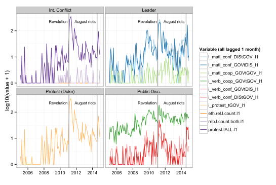
The revolution that ousted Saleh in 2011 is marked, as well as the August protests that started the most recent and ongoing crisis. Both the ICEWS (protest.tALL.l1) and our protest aggregations (i_protest_tGOV_l1), in the left two plots, show corresponding spikes. As do several of the quad variables counting verbal/material conflict/cooperation between government and dissidents or within government, shown in the right two plots.
Let’s now turn back to the progression of Yemen’s ranking again, which is in large part driven by the variables shown above. The ensemble forecast picks up the August protests and fighting for a bump in the September forecasts that push Yemen to number 9 in the rankings. This is when the Houthis took control of the capital, the prime minister resigned, and Hadi entered a power-sharing agreement. Then it drops again, and of course we don’t know what the event data look like for January, when more trouble came (ok, we know now, but our models didn’t know).
![]()
So our forecasts do pick up correctly on at least part of the story. Loosely speaking they are “correct”, in that they match the background narrative of events, up through about September 2014, from which point on the situation slowly deteriorates in a way that our models do not pick up on as much as we would like them to. Quite likely there was a spike in events that would have pushed our forecasts higher had we made them later, i.e. with January or February data, and in the end although Yemen was not included in the tables of forecasts we presented for the first half of 2015, it was still ranked highly and consistently in the top fifth of forecasts.
There is not much here to suggest systematic changes or a new direction in terms of modeling, but that in itself is good to know. Of course we would prefer more accurate models that would predict cases like Yemen higher. Although we are consistently in the high 0.8’s in out-of-sample AUC-ROC, we are just starting to scratch the surface when it comes to precision. But with data as sparse as those we are using, it is also challenging to improve performance in a robust way that survives small changes/updates in the data rather than being a symptom of overfitting.
The research described in this post was sponsored by the Political Instability Task Force (PITF). The PITF is funded by the Central Intelligence Agency. The views expressed in this article are the authors’ alone and do not represent the views of the US Government.
- Since we are modeling with country-months, and the vast majority of published work on coups, revolutions, etc. is at the country-year level, we had to improvise our own models. They are loosely based on (well-)known concepts from the conflict literature, but won’t satisfy, and might even upset, people who are engaged in the more traditional, non-forecasting kind of conflict research. But please, feel free to do your own modeling with the 2014 replication data, we would love to incorporate “guest” models that stand on more solid ground. ↩
- The rankings are largely stable from December 2014 on because in our live forecasts we hold back covariates as well, instead using carry forward imputation with limited updating for some variables like leader age, which in most cases still leads to minimal variation in the component and ensemble probabilities. ↩
- …growing awareness, there certainly have been plenty of people talking and writing about this issue over the years. ↩
- We are switching to the ETH version of EPR, which as of May 2015 was updated through 2013. There will still be a missing data problem, but much less severe. ↩

Pingback: When forecasting goes wrong (maybe): Yemen | MI Regression